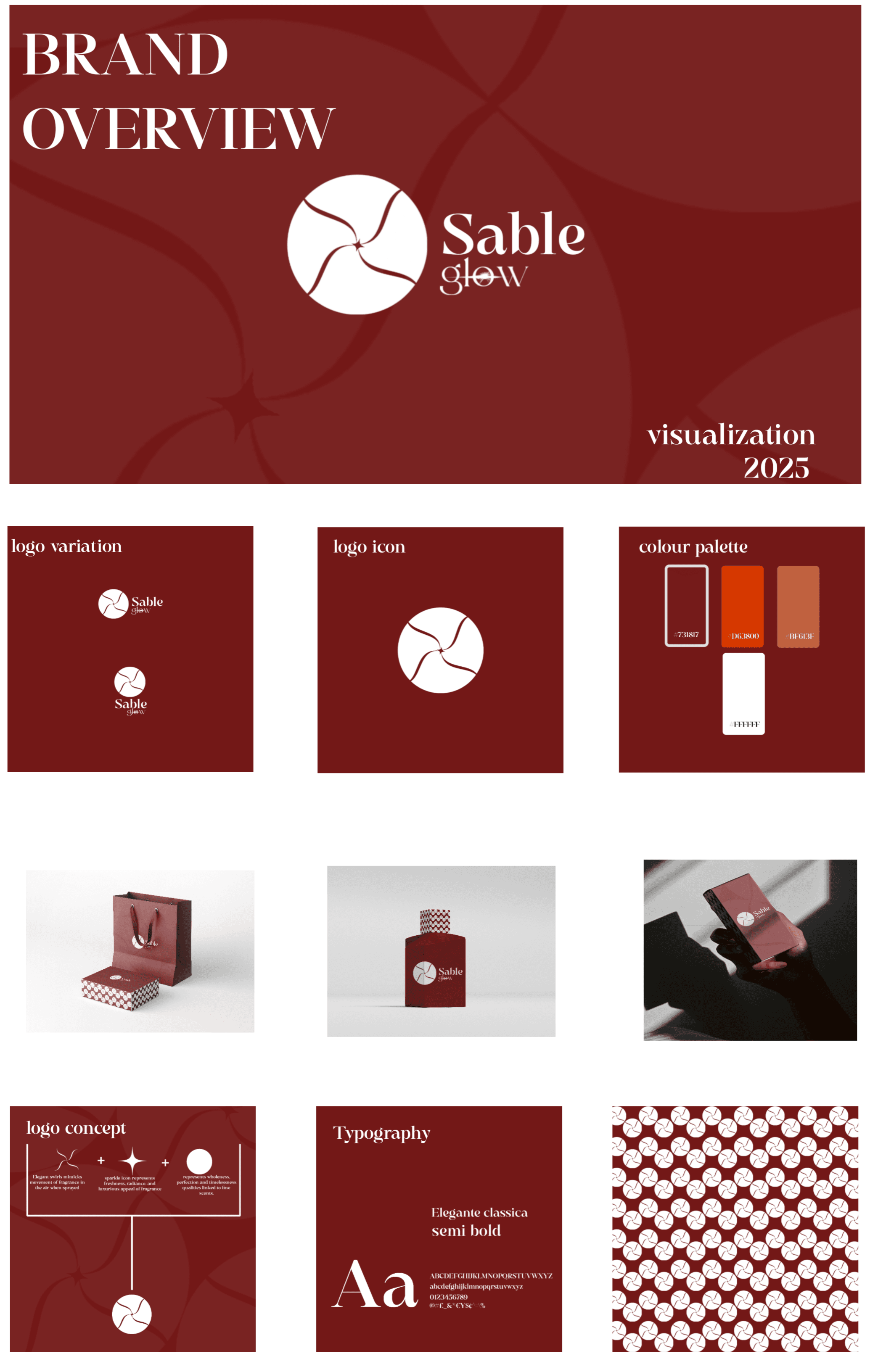
The Challenge
The luxury fragrance market is crowded with minimalist, sterile designs. Sable Glow needed an identity that felt grounded and earthy yet undeniably premium. The goal was to visualize scent—capturing the intangible essence of natural materials like sandalwood and amber—without relying on generic botanical clichés.
The Solution
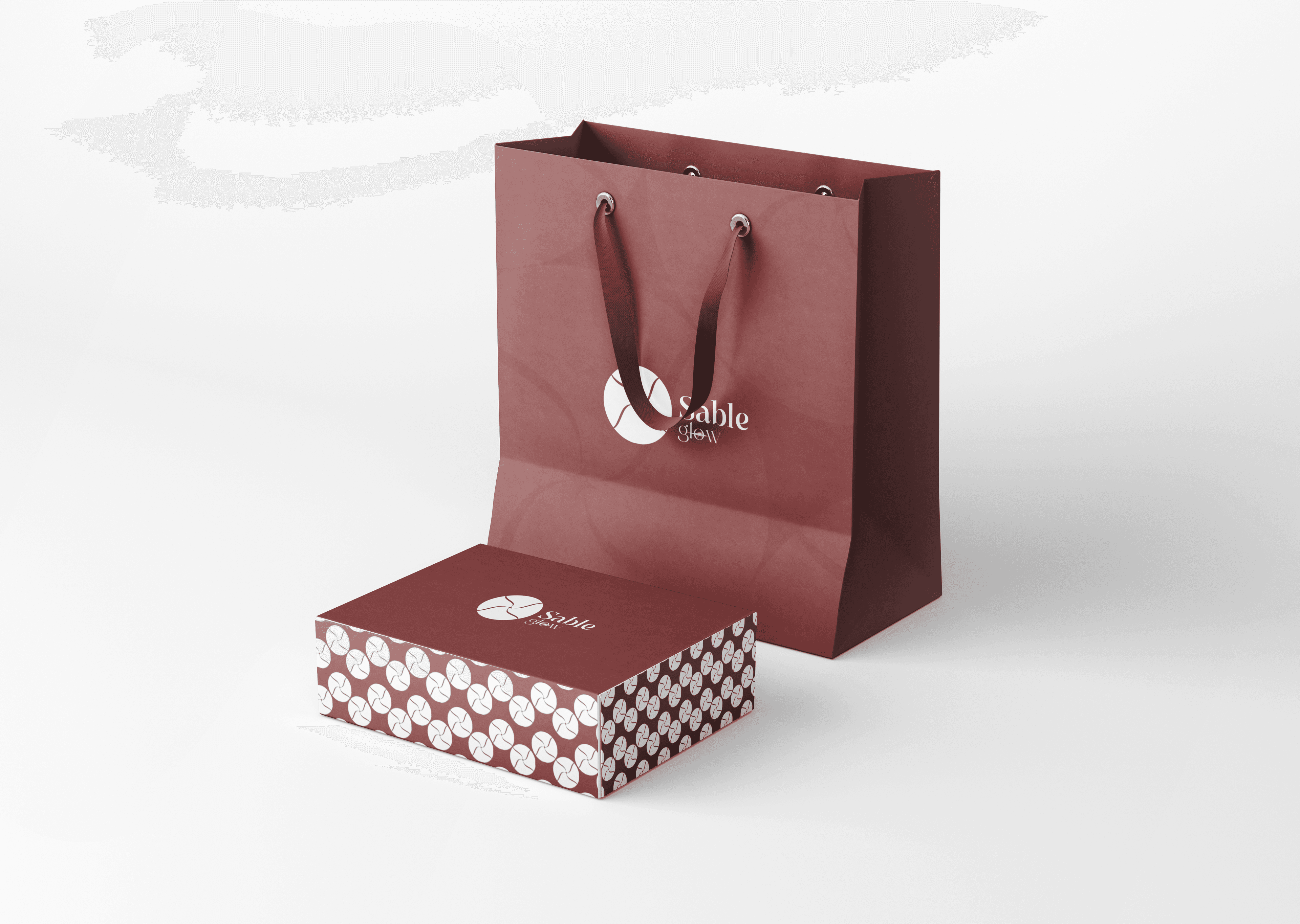
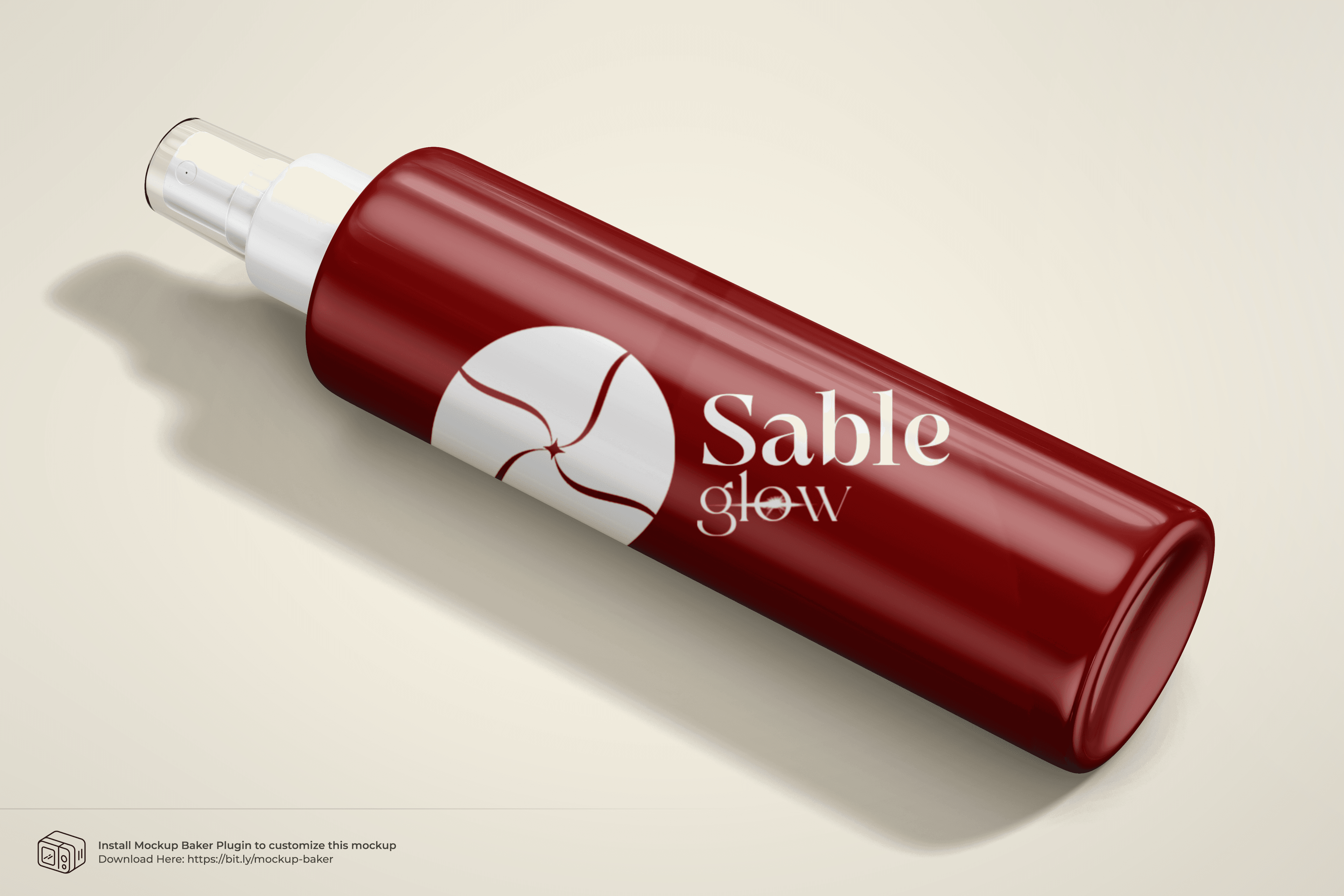
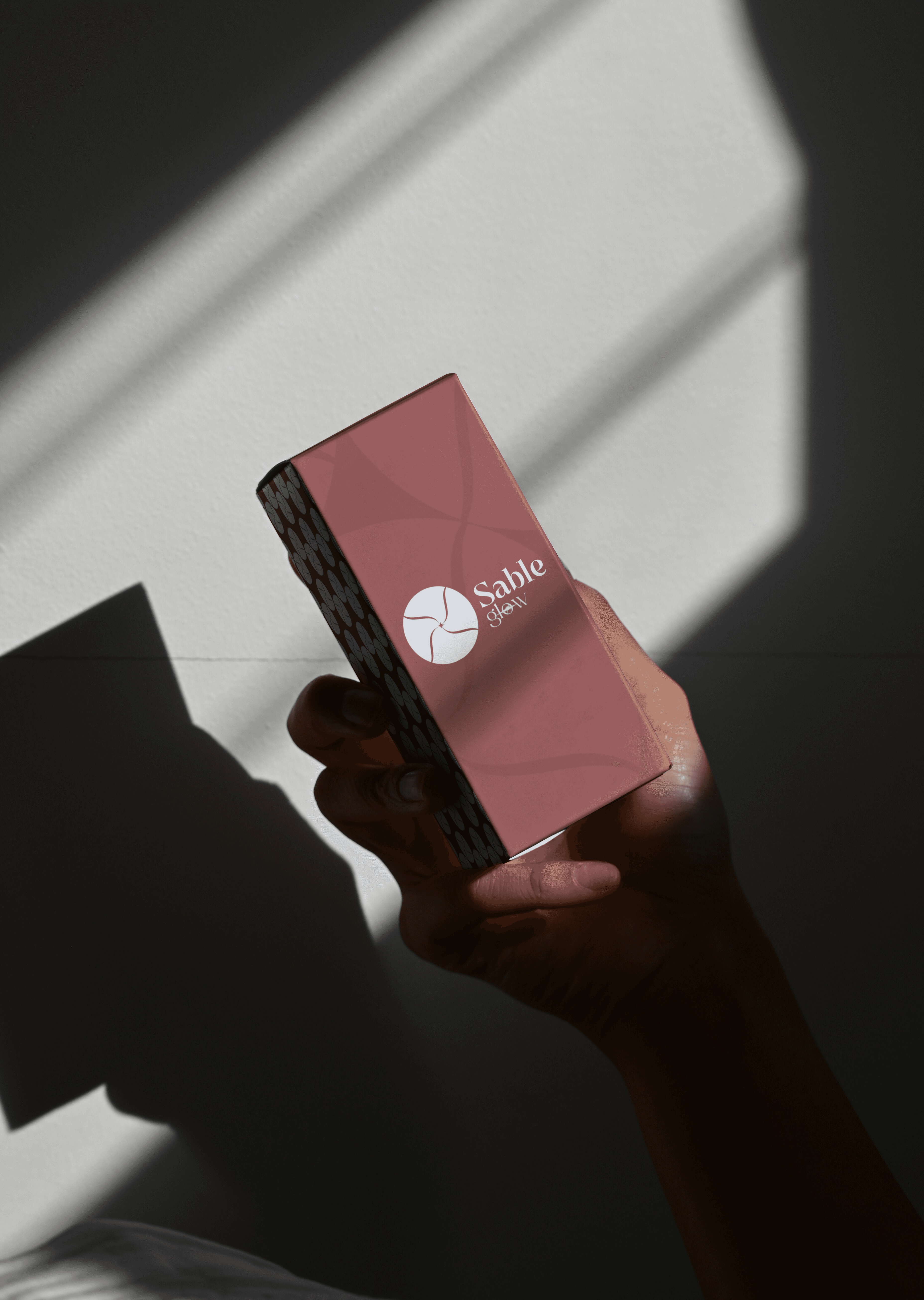
We developed a Sensory Visual Language. The logo mark features a swirling, organic motion that mimics the diffusion of scent in air. We selected a deep, oxidative color palette (Rust, Maroon, Clay) to ground the brand in the earth. The packaging uses a custom tessellating pattern representing the molecular structure of fragrance, creating a tactile experience that begins before the bottle is even opened.